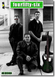
This picture
was taken by a friend of mine. I did quite a bit of touch
up, added some colored contacts in their eyes, dropped in
a scanned image of a guitar and there you have it.
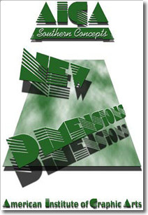
Created
as a two color t-shirt design for Southern Concepts - The
MSSC chapter of the AIGA. I thought the font went well with
the overall feeling of a graphics club. However, we didn't
end up making t-shirts that year.
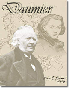
A cover
for an art history paper, this image was created from Daumier's
last photograph, first drawing of him, and of course on of
his own drawings in the background.
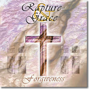
Starting
with the logo design, then adding the cross, the unique
color scheme is actually just a simple inverse of a waterfall.
The vivid greenery made the pinks, and blues. While, the
water created the brown marbling effect.
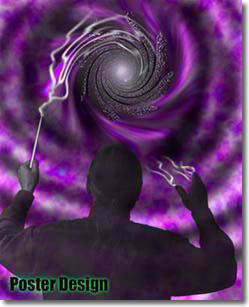
I took this
photo of one of the professor's at school, then dropped out
the background. Applying a "few" photoshop filters,
I ended up with a nice 8.5 x 11 poster.
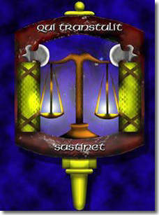
Starting
with a simple line drawing, using photoshop entirely, I
"spiced" one of the campus club's logo. The Criminal
Justice Honors Society.
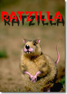
Starting with a prairie dog, I made
this interesting little creature. The story behind this "cute"
rat is a little too long to explain now. You can email for
the full one though. Drop me a line, I would love to hear
from you!
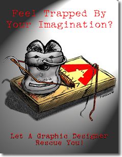
One of the few examples I have of my drawing
skills. Using a black pen and white sketch paper, I needed
some high contrast to scan. I then colorized the are in
photoshop. The mouse and the trap are seperate images. The
rest of the trap is actually behind the mouse.
I designed and built these model trucks.
I took seperate photos of them with a digital camera and
combined the two into one picture. This had to be done to
get the scaling of the two a little closer. The background
was seperated and inversed, the shadow of the mini truck
was airbrushed in. I was hoping to capture the essence of
the truck style for the overall effect.